The color turquoise is a bold yet versatile color that you can use as the dominant, secondary, or accent color in your home. It is a mixture of light blue, green, and yellow, and so combines the qualities of these hues. It can be cool and calming, like blue and green, and warm and cheerful like yellow.
So what colors go well with turquoise? Varying shades of blue, green, and neutral colors like grey, beige and dark wood can blend easily. If you are looking for contrast, choose shades of yellow, tangerine, red, and earth colors like rust.
Table of Contents
- What Colors You Should Pair With Turquoise
- 1. Turquoise and Dark Blue
- 2. Turquoise and Light Blue
- 3. Turquoise with Royal Blue
- 4. Turquoise and Teal Green
- 5. Turquoise with Dark Green
- 6. Turquoise, Beige, Cream and Brown
- 7. Turquoise, Black and Gold
- 8. Turquoise With Dark Brown And Dark Wood
- 9. Turquoise and Natural White
- 10. Turquoise With Light Grey
- 11. Turquoise and Tangerine
- 12. Turquoise and Mustard Yellow
- 13. Turquoise and Red
- 14. Turquoise and Coral
- 15. Turquoise and Earthy Tones
- 16. Turquoise and Pink
- Frequently Asked Questions
- Conclusion
What Colors You Should Pair With Turquoise
1. Turquoise and Dark Blue

In thinking about what colors match turquoise, we start off by looking at the hues that are closely related. Blue is one of the component colors of turquoise and comes in many dark or lighter shades that we can utilize for a monochromatic color scheme.
In this picture, we see more minor touches of turquoise in the curtains and the couch, but dark blue is the main color of the room.
The dark blue in the accent wall, wall art, bed cover, and pillows offset the bright tints of turquoise. This creates an overall restful and calm mood in the bedroom.
2. Turquoise and Light Blue
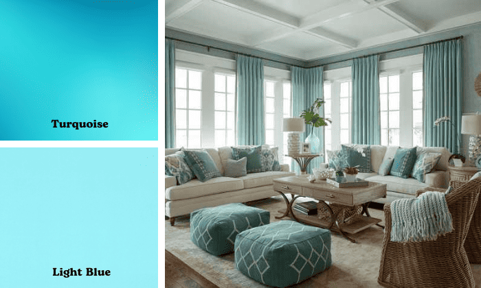
This color combination looks like the crystal clear blue waters of a white beach on a clear day. The darker panels of turquoise transition almost seamlessly to light blue, making the space feel expansive.
The room feels very light, bright, and airy, with just the right touches of dark blue on the table and wall accents. The many details of the wall accessories create a lot of visual interest against the monochromatic color palette.
3. Turquoise with Royal Blue
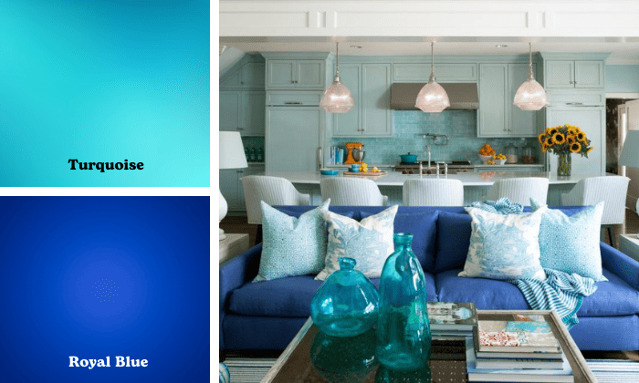
Turquoise and royal blue create quite a bold look, as both are bright colors.
Adding more neutral shades, such as a wooden bookcase or dull metallic wall art against the turquoise wall, can soften the feel of the living room.
Overall these two colors are rather high intensity or vibrant colors. They would be best suited to a busy area such as a living room or work room, where there is a lot of activity, and the energy boost from the bright tints would be helpful.
4. Turquoise and Teal Green
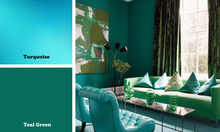
This list of colors that go with turquoise cannot skip over the green segment of the color wheel. Green is a component color of turquoise, and the right shades can be a beautiful complement.
Teal, deep blue, and green, is a bold color that creates a lush backdrop for a turquoise couch. This lower intensity and lower saturation color balances well with the bright couch and creates a more relaxed mood in the room.
5. Turquoise with Dark Green
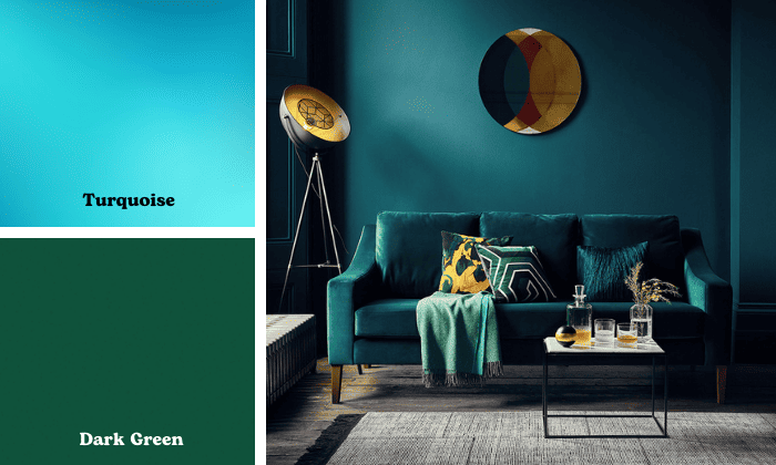
Dark green prints on an accent wall draw out the green undertones of a turquoise couch. The playful print scattered against a white wall creates a very refreshing look and youthful feel to a living room.
This is a very cool color palette, with lighter shades of pink and gold adding a little color pop.
6. Turquoise, Beige, Cream and Brown
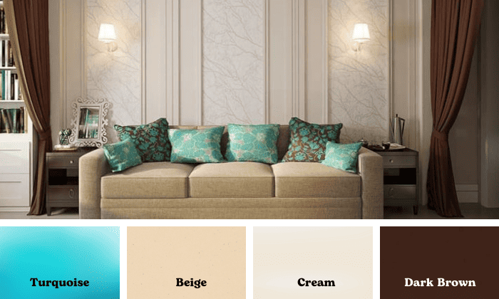
Beige, cream, and dark brown colors look good with turquoise too. In this color scheme, the neutrals are the dominant colors of the room, while turquoise throw pillows serve as accents. This very understated and elegant combination creates a very calm and relaxing living room.
Pairing turquoise with natural wood colors and light wood tones likewise works to a similar effect. The light brown or beige colors complement turquoise accents and serve as a backdrop against which turquoise colors can stand out.
7. Turquoise, Black and Gold
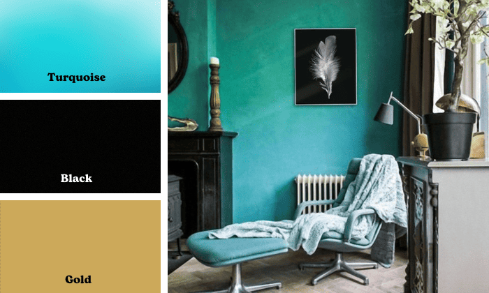
A combination of dark and bright, cool and warm hues make a well-balanced color scheme. Black and gold are also complementary colors to turquoise because of the balance they bring to the bright and cool tones. Black and gold add a warm effect to a room even used sparingly.
Black, like dark browns with turquoise, is also reminiscent of how the natural color of the turquoise gemstone occurs in nature, a vivid blue with streaks of dark color from other minerals and rock weaving through the stone.
8. Turquoise With Dark Brown And Dark Wood
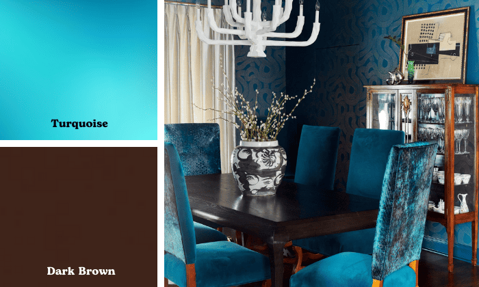
Dark brown and dark wood can be beautiful backdrops for a turquoise accent. These earthy colors that go good with turquoise provide an organic, warm feel that also levels up the masculine energy of a space.
A room that has a lot of dark wood feels smaller, more intimate, and serious, while the turquoise accent brings the light and vividness to contrast.
9. Turquoise and Natural White
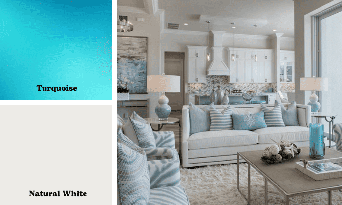
White interior wall color is a reliable classic that pairs well with any hue. As the dominant color of a room accented with turquoise soft furnishings, a natural to warm white is easier on the eyes and creates a more restful vibe. A flat or cool white may be too stark and almost clinical.
This is a minimalist color scheme that can have a strong impact if you mix your shades and textures well.
10. Turquoise With Light Grey
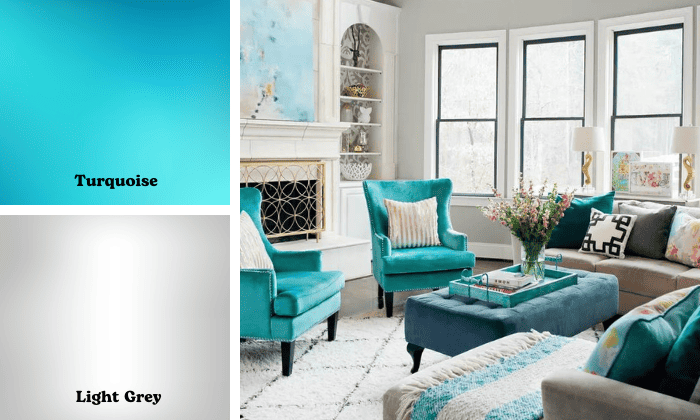
Dark turquoise chairs set against a cool grey palette creates a very contemporary minimalist style for this dining room. With a lot of natural light, this palette looks very refreshing and airy.
The warm grey undertones of the turquoise tie in harmoniously with the different shades of grey on the walls. They also add a warm tone to the chairs making them an inviting focal point of this dining room.
11. Turquoise and Tangerine
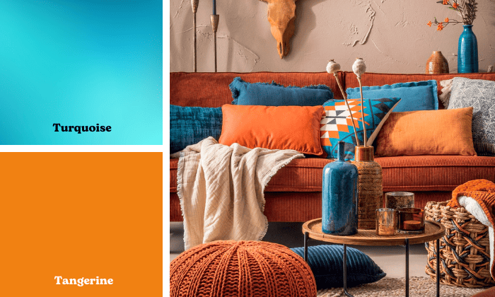
Colors that match turquoise can be bright and vivid too as long as we use them in the right amounts. Tangerine or a dark orange is a complementary color to blue and they just set each other off beautifully.
Using these two colors as accents or on smaller pieces of furniture gives brightness, character, and energy to a room, without being too overwhelming. You can paint your furniture turquoise in soft shades as well to temper the color intensity of your home decor.
12. Turquoise and Mustard Yellow
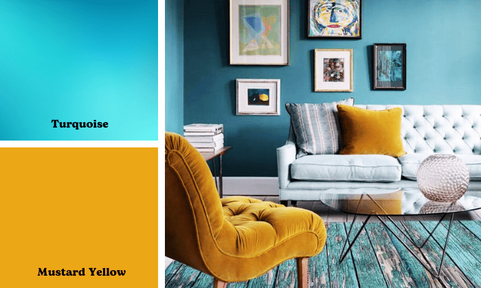
Mustard yellow is a top turquoise complementary color for its vibrancy, cheerfulness, and youthful feel. Remember that the color turquoise is a combination of blue, green, and yellow, and it is this yellow tone that gives the color turquoise its brightness and positive energy.
Similar to tangerine or orange, it is best to use this combination with some restraint and to balance with darker and cooler hues. Mustard yellow throw pillows with turquoise furniture are an easy way to bring together this eye-catching color combination.
13. Turquoise and Red
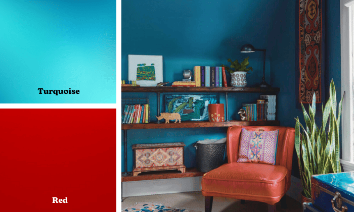
If you want to have turquoise walls in your living room, consider a less saturated shade. Increasing the grey undertones provides a more muted and neutral hue that can easily blend with warm and bright colors. You can pair turquoise with red if you use this duller shade, and they can come together beautifully without competing in brightness and intensity.
Red exudes power, confidence, and passion. It counterbalances the subtle turquoise that is more relaxed and low-key.
14. Turquoise and Coral
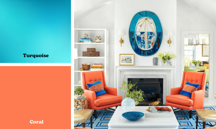
Basic color theory teaches us turquoise matches with what color is directly across it on the color wheel, and that is coral! Turquoise is a hue in between blue and green and is complementary to hues in between red and orange.
These two colors are very youthful, vibrant, and bright, creating a very cheerful atmosphere in your living space. Usually, the pair is only used together as accents in home decor.
15. Turquoise and Earthy Tones
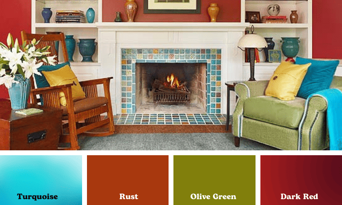
The warm undertones of a dusky turquoise mesh well with the earthy tones of dark red, rust, and olive green. These earthy colors found all around us can easily be matched with other colors of the natural world, such as blues and greens. The brown undertones provide a very calming effect but also add depth and richness to the colors of a room.
16. Turquoise and Pink
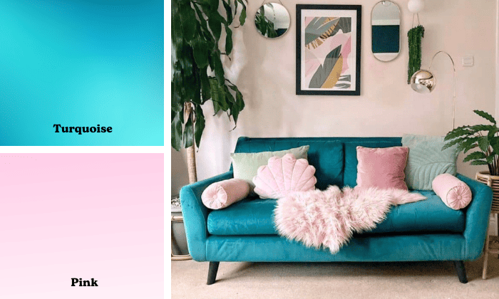
Do pink and turquoise go together? Absolutely! One simply has to find the right tints and tones that will not clash. For example, a soft shade such as a pastel pink can provide a gentle contrast to the bright turquoise color.
Similar to the other bright and warm colors like orange and yellow, pink adds youthful energy and happiness to the atmosphere of a room.
Just remember as a rule of thumb to use pink as an accent color on a smaller surface such as a throw pillow, instead of the primary room color, in order to control the intensity of hues in a space.
Frequently Asked Questions
What is the psychology of turquoise?
Turquoise in color psychology is described mostly like a blue color, evoking calmness, serenity, balance, and emotional self-control. It also symbolizes clarity and creativity.
Aloofness and a tendency to be too reserved or introverted are also associated with this color.
What are the best ways to use turquoise in your home?
Because it is a bright color, turquoise is best used as an accent color or secondary color in the home, making up 10-30% of the space. Smaller pieces of turquoise furniture or turquoise accents such as coffee table decor, area rugs or wall art can dazzle, while the primary room color is more muted and relaxing.
However, playing around with different tones of turquoise can also give us a more subdued variation that is suitable for the main wall of the room. For example, increasing the grey shade in a turquoise accent wall dials down the visual intensity of the color.
Most important is to go for balance and harmony of all colors, textures, and styles in the room.
What is the difference between aqua, turquoise, and teal?
Aqua, also known as cyan, is a pure light blue with an almost neon look. Turquoise combines darker shades of cyan, green and yellow and so is not as bright as aqua. Teal combines dark blues and greens without yellow undertones, and so is the darkest and least saturated of the three.
Conclusion
When we explore what colors go well with turquoise, we think about complements and contrasts and what can produce harmonious color combinations for our interior design. Sometimes turquoise is the main color, sometimes the accent color in a room.
Play around with closely related hues in the blue and green family, which evoke the same feel as turquoise. Neutral colors serve as a subdued and elegant complement. Lastly, warm and bright yellow, tangerine, coral, red, rust, and pink provide lively contrasts. These are more appropriate as accent colors to a room with turquoise.

Hi, I am Roseanne Jones, an aspiring home designer that wants to make you feel more at home with your new house.With nearly five years of redecorating old residents and arranging new ones, I am confident that I can give you the best advice on your lovely place.