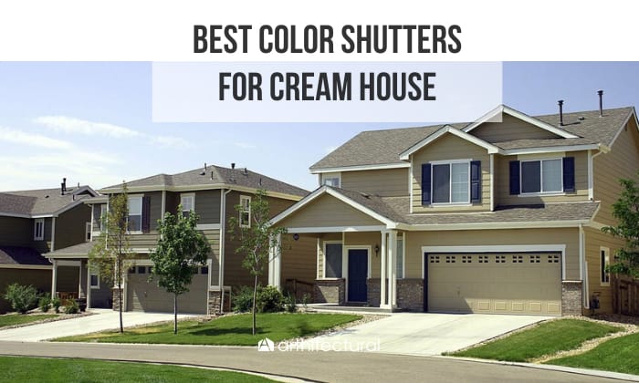
Whether for the exterior or interior, cream paint is a color that can drastically boost your house’s resale values. Of course, to make sure this is the case, you’d want to come up with an aesthetically pleasing color scheme that complements the creamy shade.
One crucial aspect of this scheme is choosing the right shutter colors, as they can enhance your home’s curb appeal without costing an arm and a leg. So, what are the best color shutters for cream house?
For a cream house with shutters, consider picking neutral accent colors like white, black, and gray. However, if you prefer cold hues, the three best options are green, blue, and teal. As for warm shades, red and purple will do.
Table of Contents
What Shutter Color for Cream House
1. Neutral shutter colors
- White
White serves as a safe and complementary neutral choice for a cream house. Plus, it’s one of the most common shutter colors, so you can rest assured that your friends, family, and neighbors will also find the shade easy on the eye.
The white shutter-cream house combination is great for gardeners who want to showcase their beautiful, colorful blooms. In this case, the flowers will be the centerpiece of your porch.
Another advantage of white shutters is that you can easily paint a bolder shade over them should you change your mind a few years down the road. Plus, they can give the impression that your house is larger.
- Black
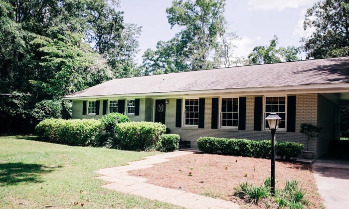
Another foolproof and timeless combination is a black colored shutter with a cream house. Classic back is my go-to recommendation, but feel free to go for whatever shade you feel complements your home exterior best.
One reason you might like this cream-black coordination is that it makes choosing accent colors much easier. There are many complementary shades for this palette, such as beige, gold, white, gray, turquoise, etc.
Even if you decide to stick to a two-toned color scheme, the clear contrast between black and cream is incredibly eye-catching. And best of all, you don’t have to think too hard about whether it’ll suit your home style.
- Gray

Gray shutters, similar to black, are a versatile and reliable choice suitable for almost any home design style. Although this classic hue can lend a timeless look to your cream house, it also has a modern vibe that helps draw the eyes.
Gray is an excellent choice for those who love the contrast that a black-and-cream color palette offers but want to tone it down a bit. It also leaves room for other complementary hues, such as sunny yellow, wood tones, beige, or violet.
The two shades of gray that will go best with cream siding and houses are stormy and charcoal gray. That said, feel free to experiment with other shades to achieve that subtle contrast you love.
2. Cold shutter colors
- Green
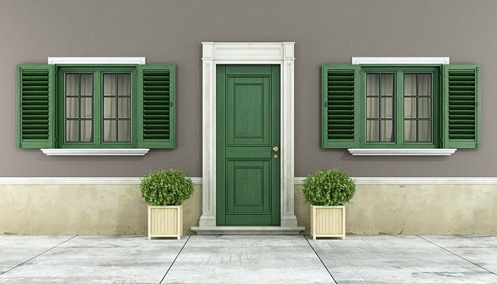
Sage green is a fantastic choice for a muted scheme that is no less appealing. It’s great for nature-loving souls trying to evoke a harmonious vibe to go with the greens around their home.
Alternatively, you can pick olive green if you love to add a little contrast to your cream color house exterior. It’s also a good idea to go for dark green for an even more eye-catching contrast.
As the green-cream pair goes well with medium wood tones, I wouldn’t hesitate to suggest incorporating some brown accents into the color scheme. For instance, a mahogany front door will be a lovely addition to your nature-oriented house.
- Blue
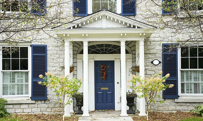
Blue is an ideal choice for homes with a nautical style, as it perfectly balances out the cream shade and lends a more colorful look to your palette. In addition, this hue also pairs well with other design schemes, be it modern, traditional, or coastal.
Among the various shades of blue, colonial blue is a great choice if you prefer your shutter color to be on the muted side. Serene and charming, this hue will make any home seem instantly inviting.
For fans of the dramatic, midnight blue would be a more appealing option. It’s perfect when you want a clear and vibrant contrast between your exterior paint and shutter. To finish the look, you can paint the siding or trim charcoal gray.
- Teal
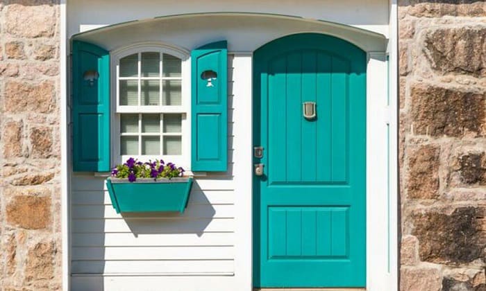
Can’t decide between blue and green? Why don’t you not choose a shade that blends these two hues — teal? This vibrant pigment will instantly add an exciting pop of color to make your house stand out — a perfect choice for youthful souls who love a playful scheme to their coastal- or tropical-style homes.
To tone down the bold contrast, add a darker neutral to the palette, such as charcoal. The combination of teal, cream, and charcoal gray accents will come across as more modern and slightly more serious.
3. Warm color shutters
- Red
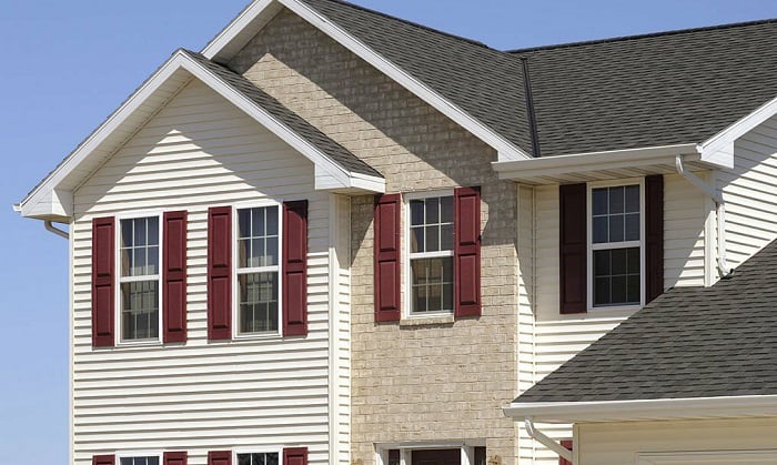
To infuse a warm and inviting ambiance into your cream-colored house, consider painting your shutters red. For the best effect, opt for a rich and dark red or one with an earthy tone.
For instance, rustic red has that earthy undertone that complements the charm of cream paint, especially when surrounded by trees, shrubs, or beautiful boulders. Owners of country-style homes will have the most success with a rustic red and cream color combination.
Meanwhile, a rich red, such as burgundy, is the perfect addition to a cream-colored home when you prefer a sophisticated and luxurious scheme. As such, although the contrast is quite bold, you’ll always find the combination elegant and classy.
- Purple
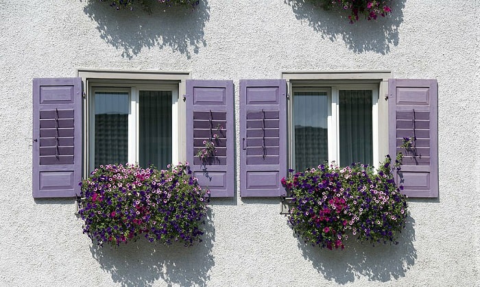
Although it may seem like an unconventional choice for shutter color, purple can still guarantee to lend your home an air of elegance. A deep shade like royal purple, for instance, can instantly bring a sophisticated contrast that you won’t be able to take your eyes off.
Victorian-style homes, however, will fare better with a more muted shade of purple—dusty lavender, as its soft elegance pairs well with intricate details and adds contrast to the Gothic architectural influence.
Lavender also has a serene note—an ideal addition to those seeking to make their home look more down-to-earth. Plus, this lovely pigment is the perfect design statement for feminine or romantic souls.
Conclusion
Now that you’ve learned the best color shutters for cream house, which one will you pick for your dream home? If you’re still sitting on the fence, one great rule of thumb is to take your door and trim color into account as well – your shutters should always match either of these two.
It’s also a good idea to stroll around your neighborhood to look for inspiration. Note that a bold choice can get your home to stand out, but it might also make it harder to sell later on.

Hi, I am Roseanne Jones, an aspiring home designer that wants to make you feel more at home with your new house.With nearly five years of redecorating old residents and arranging new ones, I am confident that I can give you the best advice on your lovely place.