While not necessarily the hardest task in home decor, choosing a suitable paint color is never easy. Different colors aside, you’ll also have to determine what specific shade you want for the paint.
If using Sherwin Williams service, you’ll hear many different terms, such as Accessible Beige, Dover White, Worldly Gray, Tricorn Black, etc. This can make finding the best paint color daunting.
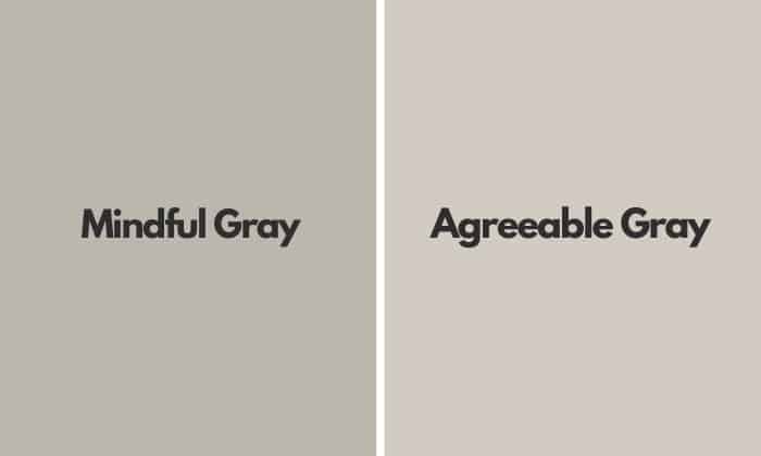
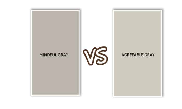
In today’s article, we’ll be looking at two of Sherwin Williams’ most popular colors – Mindful Gray Vs Agreeable Gray.
| Mindful Gray
(SW 7016) |
Agreeable Gray
(SW 7029) |
|
| RGB values |
|
|
| Light Reflective Value
(LRV) |
|
|
| Undertones |
|
|
| Place to paint |
|
|
| Appearance under different lights |
|
|
| Coordinating colors |
|
|
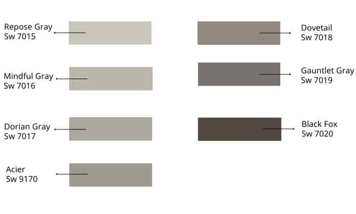
Table of Contents
What Are They?
1. Mindful Gray (SW 7016)
Sherwin Williams Mindful Gray, coded SW7016, is a light mid-toned neutral paint color that can be used for both the interior and exterior. It has an RGB value of 188 183 173 and a Light Reflective Value of 48 – meaning it can bounce off 48% of light.
Among the paint choices at Sherwin Williams, SW7016 looks strikingly similar to Dorian Gray. However, whereas Mindful Gray undertones have greige, blue, green and purple, Dorian Gray has no noticeable undertones, except for the barest hint of purple.
Other than the paint color mentioned above, Mindful Gray also partly resembles a warmer Amazing Gray as well as Anew Gray.
2. Agreeable Gray (SW 7029)
Like Mindful Gray, Agreeable Gray is a popular interior and exterior paint color from Sherwin Williams. It’s a soft, warm neutral pigment with an RGB value of 209 203 193 and an LRV of 60 – reflecting 60% of light and absorbing 40% of it.
Although the paint color name has “Gray” in it, this pigment from Sherwin Williams belongs in the yellow hue family and leans toward beige. However, its undertones are a lot more complex, consisting of taupe, light violet hints, and nearly imperceptible green.
On the color palette, Agreeable Gray looks most similar to Gossamer Veil (SW 9165), Worldly Gray (SW 7043), Repose Gray (SW 7015), and Benjamin Moore Wish AF-680.
Agreeable Gray Vs Mindful Gray – Differences
Places to paint
- Mindful Gray
As mentioned above, Mindful Gray is suitable for both exterior and interior. If used outside, this color will look like a light gray – a perfect choice for people who need a soft paint shade that isn’t too bright.
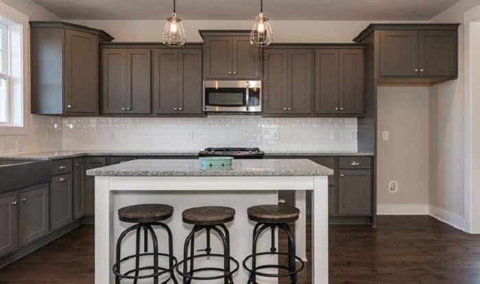
For indoor use, Mindful Gray looks best in the kitchen, regardless of whether it’s painted on the walls or the cabinets. The shade can be an excellent substitute for white – it evokes the same feelings as white but is much easier to keep clean.
You can also use Mindful Gray in the dining room and living room. The paint color will seem especially appealing if you install soft yellow lights around the space. It’ll also help if you can let natural sunlight in the room as well.
- Agreeable Gray
Like Mindful Gray, Agreeable Gray can be used indoors and outdoors. That said, as it has a higher LRV rating, it’ll reflect more light, meaning the paint will look brighter when outside. In fact, it can appear almost off-white.
Agreeable Gray’s indoor application is a lot less restricted – it can be painted in any room you want, from kitchens, bathrooms, and basements to even your bedroom. This hue is excellent as backdrops for brighter shades or as furniture color for a refreshing feel.
I’d suggest painting Agreeable Gray in rooms with plenty of natural sunlight. The resulting crisp shade can easily tone down hardwood trims with warmer colors without seeming too stark and stale.
Different lighting
No matter what you end up choosing as wall paint for your room, you need to remember how it’ll interact with natural lights. Note that rooms facing different directions will experience different sunlight exposure.
Generally, East-facing areas receive the most sunlight in the morning. In the evening, however, both Mindful Gray and Agreeable Gray rooms might appear a lot dimmer, which calls for a warm palette, such as those with golden hues.
Living quarters that face West get the most sunlight come afternoon. During this time, the lights can seem golden to almost reddish orange. As a result, Mindful Gray and Agreeable Gray in these rooms can all look a lot warmer.
Rooms with Southern exposure can expect to be flooded with bright sunbeams pretty much all day. While these rooms benefit from a bold color palette, the soft Mindful Gray can still flaunt its true neutral shade with a glowing sheen. This also applies to Agreeable Gray – which may seem warmer with a more prominent glow.
A North-facing room will receive consistently soft light, neither too harsh nor too dull, with bluish tints all day. When this hue mixes with Mindful Gray, a light color, it’ll yield a cooler tone – perfect for a calming room. In contrast, Agreeable Gray will appear even more muted.
Coordinating colors
- Mindful Gray
Pearly White SW 7009 – a soft creamy white hue – is among the three best paint colors from Sherwin Williams that go well with Mindful Gray. You can also consider using Eider White SW 7014 for a cohesive scheme, considering it has subtle gray notes.
Another excellent match is Homburg Gray SW 7622, whose undertones can seem blue, gray, or green, depending on the lighting. Other possible choices include Naval SW 6244 – a deep navy blue, and Riverway SW 6222 – a soft blue color that leans toward teal.
- Agreeable Gray
A good combination for Agreeable Gray is Extra White SW 7006; this crisp white has a high LRV for those who prefer a bright and airy space. In addition, the taupe notes in Incredible White SW 7028 will blend well with those of Agreeable Gray.
I’d also suggest choosing Coral Rose as an accent wall paint in an Agreeable Gray room. Also, don’t miss out on Dovetail SW 7018 – a dark gray color, and Brainstorm Bronze SW 7033 – a perfect candidate for people who prefer a darker taupe.
For a mesmerizing monochromatic scheme, consider pairing Agreeable Gray with Light French Gray SW0055.
Pros and Cons
The previous sections should give you an idea of the advantages these colors provide. As for their drawbacks, Mindful Gray is not ideal if you want a warmer paint under bright lighting, while Agreeable Gray won’t pair well with violet-tinted grays and dark rooms, unless you’re aiming for a dingy aesthetic.
FAQs
What colors go with grays?
A great thing about gray is that it can be combined with many colors to create different effects. For example, you can combine different shades of gray for a monochromatic scheme with dimensions and depths.
It’s also possible to pair gray with other neutral shades without worrying that the color palette will look bland or uninspiring. Black, white, beige, or brown are all excellent neutrals for a calm, relaxing gray-painted room.
For a more vibrant scheme, by all means, go for bright hues such as blush pink, navy or sky blue, dark yellow, or burgundy.
What is Sherwin Williams‘s color strip?
Color strips, also known as paint swatches, are little pieces of paper that demonstrate how the paint looks. By placing the color strips onto the walls you intend to paint, you’ll know how the lighting in your home affects the appearance of the pigment.
Color strips can consist of several paints that belong in the same color family, but with lighter or darker shades. For example, on its Sherwin Williams color strip, Mindful Gray is the second-lightest color after Repose Gray, being brighter than Dorian Gray, Acier, Dovetail, Gauntlet Gray, and Black Fox.
What is the undertone of Mindful Gray?
As mentioned above, Mindful Gray undertones consist of greige, blue, green and purple. These underlying hues are incredibly subtle, but they’re essential to keeping this paint color from looking too cold or too warm.
Tips for picking the perfect paint color
- Decide on a certain color scheme, depending on the aesthetic and feeling you want your room to evoke.
- Pay attention to the undertones and how they look under different lightning.
- Always test out the paint color first before applying it to the wall.
- Use paint color apps to see for yourself how your color scheme works out.
- The paint should suit the purpose of the room. A kitchen, for example, should look relaxing.
Modern Gray vs Agreeable Gray – what’s the difference?
When put side by side, Modern Gray and Agreeable Gray can look quite similar. Only upon closer inspection will you notice that the latter is slightly darker, looking more like gray than the former – which can seem beige to an untrained eye.
Conclusion
Now that you’ve learned the differences between Mindful Gray vs Agreeable Gray, I’m certain you know what color to pick by now. And if you’re still sitting on the fence, don’t hesitate to get a sample from Sherwin Williams to see which one is a better match.
Hopefully, you’ll be happy with your choice. We eagerly await your results!
Read more gray ideas for your home:
- Color kitchen cabinets that go with gray floors.
- What colors go with charcoal gray?
- What is the best front door color for a gray house?

Hi, I am Roseanne Jones, an aspiring home designer that wants to make you feel more at home with your new house.With nearly five years of redecorating old residents and arranging new ones, I am confident that I can give you the best advice on your lovely place.